| Graphics on the ARM | |
| Roger Amos |
Outline Fonts and the Font Editor
You may wonder what a chapter on the Acorn outline font system and the font editor application, FontEd, is doing in a book on graphics. It is included for three reasons:
- Since text plays a vital role in most graphic design, some understanding of the capabilities of the outline font system is essential for a grasp of graphics in the widest sense.
- Much of the following two chapters will be concerned with the graphical manipulation of text imported as graphics from the outline font system. Therefore some understanding of its principles will be helpful.
- The font editor, FontEd, provides an interesting example of established ARM vector graphics software that contrasts with Draw. It is, of course, a highly specialised application intended only for the creation and editing of fonts for the outline font system, but it can also be used to export characters to Draw and compatible applications as vector graphics.
This chapter does not purport to be a user manual for FontEd nor to give any kind of grounding in the fundamentals of typeface design which is a highly intricate and specialised art. It briefly describes the main features of the application in the hope that you may find it a useful adjunct to your graphics software, and if you ever need to edit a font, you may find this chapter useful.
First we need to consider the outline font system in general.
The Acorn outline font system
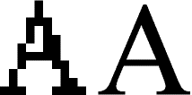
Outline font systems store the shapes of text characters as vector graphics, i.e. as outlines. The reason for the popularity of outline font systems in computers and laser printers, as we saw in Chapter 1, lies in the ease with which vector graphics can be magnified or reduced. One set of outlines provides every possible type size, the computer (or printer) simply multiplying the stored co-ordinate values by a constant appropriate to the required size. This results in beautifully smooth curves and oblique strokes at even the largest sizes, a delightful contrast from the jagged edges obtained when reproducing bitmapped characters at large sizes (see Figure 3.1). Moreover, with some limitations, condensed (narrow) and expanded (wide) characters can be created by using different constants for the vertical and horizontal axes. Users of RISC OS 3 will find that text can be easily rotated and oblique (inclined) print can be obtained from Roman (upright) fonts by specifying the required degree of obliqueness.
In the Acorn outline font system your fonts must normally be stored in an application directory named Fonts and RISC OS must know where to find this before it can run any applications that use outline fonts. If you have a hard disc, it is most convenient to locate Fonts along with System in the hard disc's root directory so that it is seen at start-up. RISC OS 3 has its own ROM- based resources filing system which includes not only the principal applications (including Draw, Edit and Paint) but also a fonts directory containing the outline font families Corpus, Homerton and Trinity. To edit these you will need a version of the font editor later than 0.27. If you edited these fonts, however, you could not save them back into ROM; to use them you would need to save them in a separate disc based Fonts directory. RISC OS 3 supports such a separate directory to hold disc-based outline font collections and if the same font names appear in both ROM and disc, the disc-based versions are used in preference. If you wish to use both the original ROM-based fonts and your disc-based edited versions, you must therefore save these with different names. The versions of Draw and Edit supplied with RISC OS 3, unlike earlier versions, impose no restriction on the numbers of outline fonts that are present.
Most fonts come in families containing a Roman, a bold, an italic and a bold italic variety, although the names used for these varieties vary somewhat from font to font. For example, the term oblique is used in place of italic where the design is simply a leaning version of the Roman. Within Fonts each font family is stored in a subdirectory having the generic font name such as Trinity, Corpus, Paladin or Vogue. Each font family directory normally contains one subdirectory for the medium or Roman varieties and one for the bold varieties. Each of these subdirectories may contain a further subdirectory for the italic varieties. Each font itself consists of two files, one called Outlines which contains the graphics and one called IntMetrics which contains data concerning the dimensions of the characters.
Oddly enough, when an application uses an outline font for pure text purposes, it does not plot the characters on the screen in the way that vector graphics are normally plotted. It would take the computer far too long to plot the thousands of characters in a well filled screen of, say, 12pt Paladin, especially bearing in mind that nearly all of the characters include curves. To speed up the plotting of text, the process is split into two stages, each character being plotted only once. The plotted image is of course a sprite, effectively a little block of screen. As characters are plotted, the resulting sprites are stored in a reserved area of memory called the font cache. Whenever the computer needs another example of a character that is already in the font cache, it copies it straight from the cache; it does not need to plot it again. Sprite plotting is a much faster operation than vector plotting as we have seen. The font cache tries to hold a copy of each character in every font you are using, so if you are using text in lots of different sizes this will take up more space in the font cache. When the font cache is full, characters will be overwritten when you need another size or style. Consequently, the size of the font cache is critical in applications that make extensive use outline fonts. It should be at least 64 Kbytes and, if you are using a font-intensive application (such as DTP) and have the memory to spare, 256 Kbytes is a more suitable size.
Anti-aliasing
There is one other important point about font cacheing. Under most normal conditions (using a font size no more than 18 pt and with a 16 or 256-colour screen mode in use) the font manager converts the outline data not to two-colour (typically black on white) sprite images, but to eight colours (black, white and six intermediate greys). You may wonder why it should do this, when the original outline was of a single-colour character. The answer is simple, it dramatically improves die quality of the screen display.
We saw at the start, of Chapter 1 (Figure 1.1) that in computer graphics there are no such things as true curves or true oblique lines. Lines that are slightly oblique are reproduced as a series of unsightly steps - a phenomenon known as aliasing. A more attractive screen display is possible by judicious use of intermediate shades in the plot, a technique called, appropriately enough, anti-aliasing. For instance, in plotting a black oblique or curved line on a white background, a pixel which is completely covered is obviously made black and one which is completely missed is made white. But a pixel 80% of whose area is covered is made dark grey, the closest available approximation to 80% black, while a pixel only 20% covered is made pale grey, the closest approximation to 20% black.
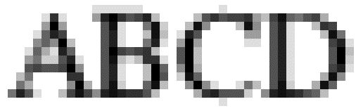
This technique appears to give text on the screen much smoother outlines than those reproduced without anti-aliasing. It is an optical illusion, but a very effective one, as anyone can discover by switching to a two-colour screen mode (in which anti-aliasing is of course impossible). Figure 5.3 shows the mode-28 screen pixel structure of some 12 pi Trinity Medium text enlarged 12 times, clearly revealing the anti-aliasing.
Anti-aliasing is not appropriate to hard-copy printing, since most printers can print in only one colour.
The font editor
The outline font editor application, Fonted is available from Acorn. Its proper use demands care. It is very easy to create fonts badly; I have examined many fonts from public domain sources and not yet have I seen one which has correct scaffolding and hinting. Of course, fonts from reputable sources such as Acorn, Computer Concepts, the Electronic Font Foundry and RISC Developments (except their public domain selections!) are correctly hinted and scaffolded.
FontEd is installed on the icon bar in the normal way and follows the conventions for RISC OS applications with one important exception: it does not issue any warning if you click on the close icon of the font index window. The window is closed immediately and edits made since the font was last saved are lost irretrievably, so it is even more important than with other applications that you save your work regularly. I have lost precious work through inadvertently clicking on the close icon in mistake for the adjacent hack icon.
As with other RISC OS applications you may work on more than one font at a time; if you have two or more fonts loaded, you can transfer characters between them, a very useful facility. But beware! On a 1-Mbyte machine with two fonts loaded, especially in Mode 20, you may run out of memory, and when the font editor runs out of memory, it simply crashes, sometimes without warning, edits since the last save being lost. So check the available memory (on the Task Display) regularly and, once again, save your work frequently. If the available memory is running low, change to a less demanding screen mode (such as mode 19) and reduce the font cache to zero. Ironically, FontEd does not use the font cache.
A further word of warning. When drawing or editing characters, for absolute accuracy you must use a zoom factor of at least 2:1 if in a multisync mode (such as mode 20) or at least 4:1 in a non-multisync mode (such as mode 12). If you use a lower zoom factor (such as the default of 1:1) the screen display, and therefore the mouse, will have a working resolution that is more coarse than the design grid of the font editor itself. This will lead to such anomalies as lines that appear horizontal on the screen proving to be slightly inclined or of strokes that appear on screen to have the same length proving to have noticeably different lengths when the character is printed. In font creation and editing it is absolutely essential to pay attention to detail. It is an activity in which your sins very quickly find you out!
There are four stages to font creation. The experienced font designer may be able to combine the first three stages into one operation, but it is best to consider them in sequence:
- drawing the outlines of the characters (and setting their widths)
- adding the hinting lines
- adding the scaffolds
- creating the composite characters (such as the accented letters).
A font can be used if it contains only the outlines and width values of the characters, but the results will be disappointing, especially at smaller printout sizes or coarser print resolutions. There are many public domain and shareware fonts in circulation that are unscaffolded and unhinted; some have been electronically converted from fonts that originated on other computer systems.
If you have not used the font editor before, you are strongly advised to load a font from a reputable source and carefully examine the structure of the characters.
Operations on whole fonts
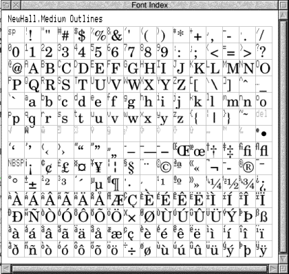
To load an existing font, either drag its Outlines icon on to the FontEd icon or double-click on its Outlines icon. If your version of FontEd is earlier than version 0.27 you must also drag the IntMetrics file icon into the opened font window. The grid in the font window will begin to fill up with anti-aliased images of the characters in the font; this is a 'background' task and you can proceed with any operation without waiting for the font display to be completed. The computer will beep when the display is finished. Figure 3.4 shows a typical complete font index window.
To create a new font from scratch, simply click SELECT on the FontEd icon. This opens a new font window which is, of course, empty. Clicking MENU with the pointer in the font window leads to the following menu of operations which affect whole fonts:
Redisplay - this simply causes the display of characters in the font window to be redrawn. It is only effective after a change of screen mode. So if you loaded the font while in, say, mode 12 and subsequently changed to mode 20, you should use this option to obtain a higher-resolution rendering of the characters.
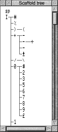
Show tree - this produces a long scrolling window listing the characters currently in the font in the order of the priority of their scaffold designs. The top of a typical scaffold tree display is shown in Figure 3.5. This may make little sense to you if you have not had experience of font design, including scaffolding. The scaffolds are sets of lines which do not appear when the character is printed, but which help consistency by ensuring that similar characters have uniform dimensions. Most often the first character to be given a scaffold is the capital 'I', whereupon this character appears at the top of the tree. Its scaffold lines are inherited by many other characters, modified as necessary, and these modified scaffolds are in turn inherited by other characters, so that each character in the font has a scaffold pattern that can be traced back eventually to that of the 'I'. The Show tree facility is very useful when scaffolding fonts as it shows at a glance which characters have not yet been given scaffolds. When applying scaffolding to an unscaffolded font, it can also be helpful to study the tree for a similar font that has been scaffolded.
Alter - this leads to a submenu of four items:
- Font name - use this to change the name of the font you are editing or to set the name of the new font you are creating. If you are starting a new font the default setting will be <Untitled>. The font name must specify the filing path between Fonts and the Outlines and IntMetrics files created by the font editor. So if you are creating a font to be named, say, Arc Light, you should enter the font name as Arc.Light. You must, of course, ensure that your Fonts directory contains a directory named Arc and that this in turn contains a directory named Light in which your Outlines and IntMetrics files will be saved.
- Design size - this is the scale of the outline drawings stored in the Outlines file. Clearly, the larger the scale, the smaller the item being portrayed. So, if for instance you load a font having a design size of 500, such as Trinity Medium, and drag a character out of the font index into a Draw window, the character will be become a path object equivalent in size to 80 pt text. If you repeat the exercise with a font having a design size of 1000, the size of the resulting path object will be only 40 pt. You can use the design size facility to re-size an entire finished font if its size proves to be inaccurate. But you should not change the size value in the midst of drawing characters. If you find that the design size is wrong after you have begun to design characters, leave the setting at its incorrect value and finish the font. Then, when the font is finished, adjust the design size setting until the size is correct. If you design some characters, then change the design size. and then design more, you may end up with a font having inconsistent character sizes.
- Skeleton - this allows you to enter a pixel size for the skeleton display. It is recommended that you leave it at the default setting of 0.
- Format - this option, available from version 0.27 onwards, offers you a choice of two file formats called version 6 and version 7. Until documentation concerning the advantages of version 7 becomes avail able, it is safer to leave the setting on the default, version 6.
Save - use this to save the font files you have created or edited. If the font has been previously loaded or saved and you wish to save it using the existing names and directory structure, you need only click on Outlines and Metrics to the right of the Save option. To save in different directories or on a back-up disc, you will need to drag the two file icons into the appropriate directory display. If the font has not been previously saved, you must delete the offered 'FontFile' for the outlines file and rename it Outlines. Drag both icons into the appropriate directory display. The directory path must coincide with the font name specified in the font editor.
Make bitmap - besides producing outline font files, the font editor will also produce bitmap font files from your outlines. You must of course specify me required font size in points and the output device resolution in dots per inch. Once specified, a new font index is produced showing the bitmapped characters, The resulting bitmap font can be saved as a file and the characters can be examined with a number of options. For most purposes this facility is likely to be of academic importance only. It does have a practical use for the font designer, however, since it ably demonstrates the beneficial effects of hinting and scaffolding by providing a representation of the font's appearance when printed at the specified size and dot density.
Debug - this is for development purposes only and is unlikely to be of interest to general users.
Operations on whole characters
To examine a character
There are two options available if you wish to look more closely at an individual character from the font index. Move the pointer over the character concerned and double click ADJUST. This opens a 'full character' window in which the character is displayed in black against a white background, these of course being the colours most frequently used in print. From version 0.27 onwards the full character window can be scaled by dragging the Adjust size icon (in its bottom right-hand corner) allowing you to see how the character will appear at various sizes.
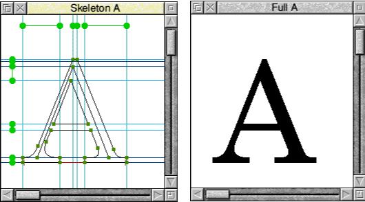
To examine the structure of a character you must open its 'skeleton window' by double clicking SELECT over the character's index entry. This is the window in which characters are created and edited. It shows the character as an outline complete with hinting lines and scaffolds, if present. The zoom facility is similar to that in Draw but allows enlargement or reduction by factors up to 1000:1 or 1:1000 in version 0.27.
The skeleton window can also be opened by clicking SELECT in the full character window. The full character window can also be opened from the skeleton window by clicking MENU and selecting the Full char option. All windows are closed in the normal way. Both skeleton and full character windows are shown in Figure 3.6. You can click over the character in the Scaffold Tree window as an alternative to the font window if you wish.
To copy a character
To copy one character into another character's slot in the index, simply move the pointer over the character to be copied, hold down SELECT and drag the character until it is exactly over the destination character's position, then release SELECt. An exact copy of the original character complete with points, hinting and scaffold lines will be made in the new character position. Note that any character previously present in the destination position will be overwritten and lost irrevocably. No warning is given.
The copy of the character is quite independent of the original; subsequent editing of either will not affect the other. Indeed this facility provides a useful shortcut in font creation when creating characters that are similar to existing ones, such as the 'F' from the 'E' or the 'Q' from the 'O'. It is also useful for making a temporary copy of a character that is being edited. If the edit proves unsuccessful, the copy (stored in a little used location such a.s &80) can be copied back to the original.
If you have loaded more than one font this operation can be used to copy characters from one font to the other. If the two fonts have different design sizes, the character being copied will be rescaled automatically by the appropriate factor. You can also drag a character into a directory display; it will be saved as a Draw file named DrawFile. You can also drag it into a Draw window where it assumes the form of a conventional path object. Note that when you drag a character into a directory' viewer or into a Draw window, scaffolding and hinting lines are removed. If you drag a compound character such as an accented letter into Draw, the separate components will all be one path in Draw, even though they originated as separate characters in FontEd.
You cannot transfer a path object directly from Draw to FontEd. An application called D2Font is available from David Pilling which converts path objects to outline fonts is discussed later.
There is another way to copy a character; see below.
To merge two or more characters
If you hold down Shift while you drag one character into another's location, you will again obtain a copy of the original in the destination location, but this copy is different in several important respects from that obtained without Shift. Firstly, the copy is an outline only; it has no points or scaffold lines and cannot he edited. It is an example of replication, it is a clone of its source character and will reflect any subsequent changes to the source character. Secondly, copying with Shift does not overwrite any character already in the destination location. Any character previously present will still be present, the outline of the copied character being superimposed over it. But note that if these outlines overlap, the overlapping area will appear transparent when applications reproduce the character on screen and in printouts. (In other words, the two outlines constitute one object and the outline font system follows the even/odd winding rule.)
This Shift-drag process is often used to merge two or more characters, e.g. to add an accent to a letter. If you hold down Shift as you drag the letter component into the destination 'slot' and again as you drag the accent component character into the same 'slot', both components of your compound character will be outline-only clones and this is fine for most accented letters. Alternatively, one component may use a conventional copy without Shift, while the other alone is Shift-dragged. This is useful where the accented character is slightly different from the non-accented form and therefore needs editing. For instance, in the accented forms of the letter i the dot must be eliminated, viz: �. So, copy i into the � location in the normal manner, delete the curves that make up the dot and then Shift- drag the undotted character into the other locations where it is needed. Finally Shift-drag the accents into the appropriate locations.
You can change the positions of the 'clone' components in a composite character. Move the pointer into the skeleton window and click select. Each time you click Select a different outline will become 'mobile', although this is not immediately apparent on the screen. The mobile component can be moved using the cursor keys; faster movement is obtained by using the cursor keys in conjunction with Ctrl. Whenever you create a composite character, you should always move at least one of the components, even if only to return it to its original position. Failure to move at least one component leads to incomplete data in the IntMetrics file and this can cause a multiplicity of malfunctions when the font is subsequently used by applications. (The most common symptom is the screen display refusing to display the affected characters or, sometimes, any characters from the affected font.)
You can superimpose many characters by Shift- dragging them in this way. But there are some limitations. You cannot Shift-drag a character that consists only of Shift-dragged outlines; this has no effect. (But you can copy such a character in the normal manner.) If you Shift-drag a character that consists partly of conventional drawing and partly of Shift-dragged outlines, only the outline of die conventional drawings will be transferred. You cannot Shift-drag a character onto itself, nor can you Shift-drag the same character more than once into the same location; the second Shift- drag deletes the first. So you cannot create the colon (':') by Shift-dragging the full-stop twice, although you can create it by conventionally copying the full stop and then Shift-dragging the full stop into the same location. You could, of course, create the semicolon (';') by Shift- dragging the comma and the full stop into its location. In this way you not only save yourself much wasteful duplication of effort, but you also ensure that common features are absolutely consistent.
You cannot delete a cloned component of a compound character. If you make a mistake and Shift-drag the wrong character into the location, your only option is to delete the affected character and start again from scratch.
To delete a character
Drag an undefined character into its location. The character previously in the location is lost irretrievably. Caution! No warning is given. If there are no undefined characters, you could drag the space or NBSP (non-break space, ASCII &AO) into the location concerned. The location will now of course contain a copy of the space complete with its width setting.
To add one character's scaffold to another character
Hold down Ctrl and drag the source character into the destination character's slot or skeleton window. Only the scaffold is affected. The two characters' outlines are preserved. This operation will not transfer scaffolds between fonts.
To compare two characters
Open one character's skeleton window and then drag the other character into it. The dragged character's outline only will appear in pale grey superimposed on the present character. To remove the superimposed character, drag a space or NBSP or any undefined character into the skeleton window. This facility is useful for comparing characters for size or height, especially when building scaffold trees. The two characters need not be from the same font.
You may sometimes find yourself in the situation of wanting to modify a character's structure while preserving its overall shape, for example, if for scaffolding purposes you wish to add an extra point into a curve, but you cannot afford to lose the line of the existing curve. Proceed as follows. Copy your original character into an unused slot, say &80. Now drag &80 into your original's skeleton window. At first it seems that nothing has happened, but when you move or delete your curved line you will find a pale copy of the original beneath it. This is of course the outline of the copy in &80. You can now add your extra point and adjust your new curves so that they follow the original line. Finally, delete the copy in &80.
From version 0.27 onwards you can also drag sprites into skeleton windows. The sprite must have been created in a two-colour mode such as mode 18. Once loaded it is enclosed in a frame with eight handles like a DTP frame; these allow it to lie squashed, stretched or moved. This remarkable facility allows you to create fonts by scanning an example of the required typeface and dragging the resulting sprites into FontEd for use as templates around which the character outlines can be 'traced'. For more on this see below on Display in die Skeleton menu.
Character creation and editing
Drawing character outlines is broadly similar to creating path objects in Draw but there are several fundamental differences. All drawing and editing is done in the character's skeleton window. You will not be able to draw if a scaffold is selected, i.e. shown in red, (press Escape to deselect it) or if a sprite is active (turn off its handles from the Display menu-click MENU in the skeleton window).
Drawing lines
To draw a line, position the pointer where you wish the line to begin and press SELECT. Continue holding down SELECT and drag to the end of die line. Then release SELECT. You now have an isolated line with a point at each end. Points are shown as green squares. To draw an entire outline with many points proceed as before but wherever you wish to create a point momentarily release SELECT and then press it again and continue drawing. To complete the outline bring the pointer back over the starting point and release SELECT. The computer will beep to tell you that it has joined two lines at the current pointer position. If you have a full character window open (and this is recommended) you will see that the outline is automatically filled in solid as soon as it is complete.
Sometimes, although you heard the computer beep as you completed the outline, the display in the full character window remains an empty outline. This means that the outline is broken somewhere. You probably moved the mouse a little while your finger was off SELECT at one of the points so that. although the screen shows what looks like a complete outline, one of the points is in fact two separate points with an infinitesimal gap between them. To find the offending point(s) move the pointer on to each point in turn and on each press ADJUST. Hold ADJUST down for a second or two. At one point you should find that the computer beeps and the full character display goes solid. If the computer beeps but the full character display still remains stubbornly hollow, you have yet another break somewhere else in your outline and must continue your search. If your character has a hollow centre (such as the 'O' or the 'A', you will of course need to create separate outer and inner outlines with a deliberate break between them. Both outlines must be continuous. If there is a break in the inner outline while the outer is intact, the character's image in the Full character window will appear solid rather than hollow.
Moving lines
You can move any point by placing the pointer on it and dragging it while holding down ADJUST. So any line can be moved by moving the points at each end of it. There is also a means of moving whole characters or parts of characters, see below.
Curves
All lines are initially straight lines but have the potential to become curves. To change a line to a curve you must first select it. Place the pointer on the line itself, i.e. between the two points, and click ADJUST. The line will become blue and two red control points will appear on it. FontEd like Draw uses Bezier curves, but in FontEd only one line may be selected at any one time and the control points are only visible on the line that is selected. Moreover, as soon as you move the pointer over one control point and press ADJUST, the other control point disappears. This does in fact help the designer working on complex curves, since the multiplicity of overlapping control points that appear when a sinuous path object is taken into edit mode in Draw can be overwhelming. To bend your line, place the pointer on a control point and move it just as you would any other point.
To straighten a curved line, select it, press MENU and click on the second option, Straighten.
To deselect a line, click SELECT elsewhere or press Escape.
Moves
Moves are implicit in FontEd. That is to say, you do not have to create them especially. Every character is one object, even if it contains several distinct outlines. The different outlines are therefore separated by implicit moves.
Deleting lines
Select the line, press MENU and click on the first option, Delete. Deleting a line in a continuous outline does not result in a smaller continuous outline as it would in Draw. It leaves a gap (in effect a move) in the outline. To add an extra point into an outline Position the pointer over an existing point and click SELECT. It will seem that nothing has happened, but your original point has in fact become two points superimposed and joined by a line of zero length. If you attempt to drag the uppermost point with ADJUST you will drag first one control point on the new line, next its other control point and finally the new point itself. With the new point correctly positioned, you can use the Straighten facility to straighten out the new line.
Alternatively, position the pointer over an existing point and select-drag to the required new position. A new straight line will be created within the existing outline.
To open the path of an outline
Either select any line and delete it or, if you wish to retain all the existing lines and open the path at a point, create a new line (as above) and immediately delete it in the normal manner.
To move the whole or part of a character
The font editor does provide a facility which allows a whole character or any selection of points in it to be moved an equal number of coordinate steps in any direction. This is useful for repositioning whole characters and, in conjunction with the scaffolds (see later), ensuring that similar characters like the 'm' and the 'n' have uniform height. The facility uses the scaffold system; to access it you must enter scaffold mode. If you already have one or more scaffolds present, simply select one of them. If there are no scaffolds present in the existing character, you must temporarily introduce one, as follows. Click MENU and move the pointer over the third item, Scaffold. On the scaffold menu select the first item, New local. On the New local scaffold menu you could select any option, but the top item is most convenient, H-scaffold. This will put a bright blue horizontal line across the character. For our purposes its position is immaterial. Select the scaffold by clicking SELECT in the 'blip' at its left-hand end; the scaffold will change to red to show it is selected.
Now you must link the points which you want to move to the selected scaffold. To do this you either move the pointer over the point and click SELECT or, if there are many points which you want to move, you move the pointer to a position where it is not over any lines, hold down SELECT and drag out a box which embraces the points you wish to link. When the box encloses the points concerned, release SELECT. The points which have been linked will change to red. Clicking SELECT on any point will toggle its link on and off. You can unlink all the linked points by pressing function key F9. Points do not need to be on or even near to the scaffold to which they are linked.
While the points appear in red to show they are linked to the selected scaffold, you can move them using the cursor keys. Each stab on a cursor key will move all the linked points one coordinate step in that direction. Using Ctrl in conjunction with the cursor keys will give faster movement. In this way any number of points from one to an entire character can be repositioned.
If you created the scaffold simply in order to move the points, you should afterwards unlink the points using F9 and then delete the scaffold; press Menu and select the top option, Delete.
If you used an already existing scaffold line, you will have to decide carefully which points should be unlinked and possibly relinked to their original scaffolds-see later on scaffolding.
Adding hinting
Hinting lines are ordinary lines along the centre of certain strokes. Their purpose is to ensure that, when the screen or printer is reproducing the character at a very small size, something is drawn to represent that stroke. See the section on thin lines in Chapter 2 for further details.
Hinting lines are needed in all curved strokes and in all straight strokes which are oblique, i.e. neither horizontal nor vertical. They may be omitted in very bold oblique strokes, where it is almost unthinkable that the stroke could ever fail to appear. Thus the capital 'A' will require a hinting line in each of its two major strokes since both are oblique, but not in the cross stroke since that is horizontal.
A point to remember is that in characters which have a hollow centre, such as the 'O', there must be at least one break in the hinting line; it must on no account form a complete loop. If it does, the drawing will consist of three concentric outlines. By the application of the odd/even winding rule the area between the outer and central outlines would be filled as would the inner; thus the letter 'O' would appear to consist of a very thin ring closely surrounding a filled ovoid. The position of the break is immaterial, but it is best to put it at a point where the outline is thick and so not in danger of disappearing.
The Skeleton menu
Clicking MENU while the pointer is in the skeleton window leads to the following menu of useful facilities:
Delete - this deletes the currently selected line or scaffold. The option is greyed out if no line or scaffold is currently selected.
Straighten - this straightens the currently selected line. The option is greyed out if there is no line currently selected.
Scaffold - this leads to a further menu concerned exclusively with operations on scaffolds, See the section on scaffolds, below.
Display - this leads to a further menu concerned with the skeleton display. This will be considered below.
Full char - this opens a full-character window for the character concerned. The skeleton window is left open.
Width - this opens a dialogue box displaying the current width setting of the character concerned. If no width has been set, the value shown will be 0. You may edit the value as required. The width is represented in the skeleton window as a red line along the x axis. The width unit is 1/1000 em and relates to the character reproduced at 12 pt size.
Zoom - the zoom facility is similar to that in Draw. The maximum zoom avail able in version 0.27 is 1000:1 and the minimum 1:1000. The variable facility automatically adjusts the zoom setting so that the entire character fits in the skeleton window. When disabled, the zoom defaults to the setting displayed.
The Display menu
The Display Menu has eight options (in version 0.27) which relate to facilities that can be optionally displayed in the skeleton window. A tick appears beside each option that has been selected. Clicking on items toggles them on and off.
Pointer - this is selected by default. When deselected the pointer disappears during drag operations. During fine work it can be useful to disable the pointer to prevent it from concealing parts of the outline.
Coords - this is deselected by default. When selected, the current x and y co-ordinates of the pointer are displayed alongside it during drag operations. This can be useful, especially when no scaffolds are present, since it helps to ensure the use of consistent heights and widths throughout a font.
Width - this is selected by default. This is the red line displaying the currently set character width along the x axis.
Char BBox, Orig BBox, Font BBox - all three bounding boxes are deselected by default. The Character bounding box, displayed as a solid red line when selected, is the hypothetical box that just encloses the character concerned. The Original bounding box, displayed in green, is initially the same as the Character bounding box, but if you edit the character and extend one of its strokes outside the Character bounding box, you will find that the Character bounding box is updated, while the Original bounding box remains the same. The Font bounding box, shown as a dashed red line, represents the extreme limits of all the characters in the font.
Bitmap, Handles - these facilities, only available from version 0.27 onwards, control the display of sprites by the font editor. The sprite to be displayed must be in a two-colour mode such as mode 0, mode 18 or mode 25. If the Bitmap option is selected, the sprite can be displayed by dragging its file icon into the skeleton window.
Even if it originated as a black design against a white background, for example as the output of a scanner, in FontEd it will be displayed in white against a pale grey background. It will disappear if the Bitmap option is disabled. If the Handles option is selected, the sprite will be enclosed in a dashed red boundary box with eight handles (see Figure 3.8). The sprite can be moved by placing the pointer inside the boundary box and dragging with SELECT. The sprite can be enlarged, reduced, squashed or expanded using the handles. Handles in the centre of a side move that side; those in the corners move that corner while the diagonally opposite corner remains fixed.
Scaffolding
Scaffolds are special lines which are introduced into the character design, but which do not appear in normal screen displays or printouts. Their purpose is to tidy up the display of characters so that similar strokes have consistent widths and lengths not only within each character, but throughout the font. The scaffolds which have been used in one character can be passed on to another similar character to ensure consistency. They also control the way in which curved lines are reproduced, The following account is of necessity a simplification.
Each character is allowed to use a maximum of seven vertical and seven horizontal scaffolds, numbered 1 to 7. In fact there also exist a pair of default scaffolds (one vertical and one horizontal, numbered 0). Every point in every character is always linked to two scaffolds, one vertical and one horizontal; when a point is first created it is automatically linked to the default scaffolds and is only disconnected from these when you connect it instead to another scaffold. Scaffolds in the same axis can also be linked to each other to ensure that similar characters have identical width or height.
In the horizontal axis mere are three types of scaffold: the H-scaffold, the U-tangent and the D- tangent. H-scaffolds are used with horizontal or nearly horizontal strokes: in Figure 3.9 three H- scaffolds are visible on the three horizontal strokes of the character. Each H-scaffold consists of two parallel lines. When an H-scaffold is first introduced it appears to consist of a single line, but this is only because the two lines are co-incident. The position of the two lines is altered by dragging the circular blob at the top end of the line with ADJUST (dragging with SELECT will draw a line). Note that the two lines cannot be separated by more than 255 internal units. When points are linked to the scaffold (how to do this is explained later) those points will be reproduced in such a way as to give that stroke (and other similar strokes elsewhere in the font) consistent width.
U-tangents and D-tangents are used with curved strokes and, as their names suggest, they are positioned so that they just touch the outer extremity of the curve. i.e. they are a tangent to it. the U-tangent being at the upper extremity of the curve and the D-tangent at the lower extremity; examples of both are visible in Figure 3.9. Their purpose is partly to ensure that characters are consistently positioned throughout the font, in many fonts rounded characters such as the C, O and U sit a little below the baseline used by square characters, and partly to ensure that the curves are reproduced as smoothly as possible.
In the vertical axis there are three types of scaffold, the V-scaffold, the L-tangent and the R- tangent, which correspond in function and use to the H-scaffold, U-tangent and D-tangent respectively. The "blobs' are at the left-hand end of the scaffolds. Again, examples of all three types are visible in Figure 3.9.
Scaffold lines are shown in pale blue if they are new, i.e. introduced on this character. They are shown in dark blue if they are inherited from another character. They are shown in red when selected. To select a scaffold click SELECT on its blob. In the font index and also the scaffold tree display all characters containing the selected scaffold will be highlighted in red, enabling you to see at a glance which characters will be affected by changes to the scaffold. To deselect a scaffold either press Escape or click Shift-SELECT elsewhere in the skeleton window. To delete a scaffold, first select it and then choose Delete in the main menu; it is the same as deleting a line.
To link one scaffold to another, select the first scaffold and click Shift-SELECT on the blob of the scaffold you wish to link. This blob will change colour whenever the other scaffold is selected. To disconnect it, click Shift-SELECT again. To link points to a scaffold, select the scaffold and then either click SELECT on the points you wish to link or drag out a box with SELECT. When you release SELECT all the points enclosed by the box will be linked. Linked points are shown in red. Clicking SELECT on a linked point unlinks (or 'disconnects') it. Key F9 will disconnect all points from the selected scaffold. Note that points do not have to be directly over the scaffold to which they are connected.
To introduce a new scaffold into a character in a skeleton window, move right on the Scaffold option in the main menu. This leads to a sub-menu in which some options will be greyed out because they are inappropriate. The first three items all lead to a further submenu offering the six different scaffold types already discussed.
Choose the first option, New local, if the scaffold is only required in the current character, i.e. you will not wish to pass the scaffold on to other similar characters. Choose the second option if you wish your scaffold to be passed on to other characters. Because each character may have a maximum of only seven scaffolds in each axis and because most characters inherit scaffolds from other characters, there will be many occasions when there are no free scaffolds available hut there are unwanted scaffolds in the character. The Replace option allows you to select an unwanted scaffold and to delete it and replace it with a new one. Clearly, the new scaffold must be in the same axis as the original; it will be local if the original was local and global if the original was global. The operation is a short-cut method of deleting and introducing a new scaffold. If you inadvertently delete a scaffold, the next option. Undelete, restores it. The final option. Disconnect, duplicates the action of the F9 key. disconnecting all points from the currently selected scaffold.
In practice there is little difference between local and global scaffolds. Either type is passed on to other characters by character duplication or Ctrl-dragging. If you subsequently move a scaffold line, the move will apply in every character that uses the same scaffold.
Removing scaffolds
You may occasionally wish to remove the scaffolds from a font, perhaps if it has been incorrectly scaffolded and you wish to begin again. Proceed with great care! Save the font very frequently, since in these circumstances crashes occur very easily. It is wisest to start with characters at the bottom of the scaffold tree and work upwards. You may find that attempts to delete scaffolds result in error messages of the type 'Incomplete scaffold link in n' where n may or may not be the character on which you are working. If it is a different character, leave the one on which you were working and attend to the other before returning to the original. It is sometimes impossible to delete a scaffold if it is connected to another scaffold, so undo all scaffold links before attempting to delete a scaffold.
D2Font
As mentioned earlier, characters can be dragged from the FontEd font index into directory displays or Draw windows, where they are treated as ordinary Draw files containing a single path object. Draw files, however, cannot be dragged into FontEd, it refuses to recognise them. A fascinating and inexpensive application called D2Font from David Pilling, however, converts Draw files to outline fonts.
D2Font is supplied on the same disc as Trace (see chapter 12) which converts sprites to Draw files. Also supplied on that disc are some scanned images of attractive typefaces. Clearly the user is encouraged to use Trace to convert these scanned images to Draw path objects and D2Font to convert those to usable outline fonts. The process is time consuming and there is much tidying for the user to do, but for those with time to spare it is all quite feasible. D2Font's main window (Figure 3.10) is very similar to that of FontEd, showing each character present. Operation is simple. Out of Draw (or whatever) you save the path objects that make up each character, dragging their file icons into the appropriate locations in D2Font's index. This in itself is a long process if you have anything approaching a complete character set. Bear in mind that if the Draw file originated in Trace or a similar application, some characters such as the 'O', the 'B' and the 'P' will contain more than one outline and these may initially be separate objects; it is a wise precaution to group them to prevent them from moving relative to one another.
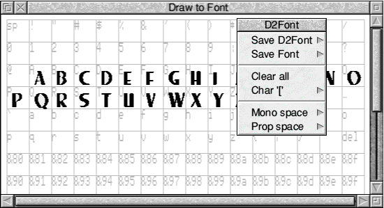
D2Font offers the option of saving the entire font; you enter the appropriate directory name and it saves a directory containing an Outlines and an IntMetrics file which can be used immediately, but which will almost certainly need some further editing in FontEd. You can also save your unfinished font in D2Font format. This will allow you to resume transferring designs into it later on if you do not have time to manage them all in one session. Incidentally, you can also drag individual characters out of the index as Draw files. They will be in the same condition as when you imported them.
Other options allow you to clear all designs and restart with an empty window, to clear individual characters and to select one of two character width options. One of these automatically sets a width that is proportional to each individual character's width and the other sets one constant width throughout the font, as in Acorn Corpus. The only other facility offered sets the position of the character. Double-clicking in any character's compartment opens a window containing a large view of that character sitting on a red line which indicates both the character's width and its position relative to the base line. By default, D2Font positions all characters so that their lowest extremity is right on the base line; it has no way of recognising descenders. Consequently you will need to reposition characters having descenders such as 'g', 'p' and 'y'. You could do this later in FontEd, but it's easier in D2Font. Dragging with SELECT adjusts the height of the base line; dragging with ADJUST changes the width.
Incidentally, there is a useful function for D2Font and FontEd that is totally unrelated to fonts. This is to merge several path objects into one. Vector's Merge Path and ArtWorks' Join Shapes (see chapter 5) menu options perform this operation which can lead to worthwhile savings of memory and redrawing time; it also allows holes or windows to be created in existing objects. Those who don't own Vector or ArtWorks but do have D2Font and FontEd may proceed as follows. Group the objects to be merged. Save the group into any character location in D2Font. Save the font under any name, even if it consists of just the single character. Load the font into FontEd and then drag the character back into Draw (or whatever). It will now be one path object, the formerly separate paths being joined by moves. The process works best if the initial path objects are closed paths; the font editor, after all, is used to dealing with outlines. Oddly enough, in die resulting merged object, the sub-paths are open.
Edited fonts and PostScript printers
Unlike other types of printer, a PostScript printer uses fonts stored in the printer rather than taking an image of the page from the computer. For this reason, you need a PostScript font to match each font you wish to you use. If you create or edit a font yourself using FontEd, clearly you will not have a matching font in your printer so you will not automatically be able to reproduce what you see on the screen. If you have RISC OS 3, however, you can download fonts to your printer from the computer. This enables you to use new or edited fonts and to reproduce them in your printout. Downloading fonts in this way uses up a lot of printer memory; you may find that you need to buy extra memory for your printer (not your computer) if you want to download many fonts. You cannot download fonts from RISC OS 2.